Paint Box

Friday, 5 April 2013

Post Tutorial Research

Following my tutorial, there were many lines of inquiry that we discussed that I need to research. Colour is the focus but as I discovered, the ideas are broad ranging and tenuously linked. This is how I like to pursue ideas; they circle broadly round a central theme or interest and gradually become more focused and specific as the work evolves. 

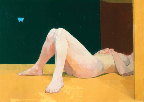
I have researched Ewan Uglow and can see why he is relevant to my practice. The subtly of colour, evidence of planning composition and quietness in the paintings show careful technical consideration. In particular, the way the light is reflected to introduce and unify colour around the painting space shows sensitivity which currently my paintings lack. I don't want to lose all the saturation but this seems to be a more conscious approach to integrating a wide palette. 

Ewan Uglow


http://www.bbc.co.uk/arts/yourpaintings/paintings/search/painted_by/euan-uglow_artists

I have also researched John Constable's use of colour following a discussion about creating space within a painting by using colours which recede and emerge to trick the eye. This quote sums up a key point about Constable's technique...
'Constable had to create new techniques to give the realistic appearance of flowing water and wind blowing through trees. By layering reds with the greens of his trees, the artist was able to create this depth in a way which had never been done before. Not only this, but the reds added a vibrancy to the trees, something that was missing from classical landscapes.'
http://www.artble.com/artists/john_constable

The vivid, more saturated reds and lime greens in the foreground of the painting force the viewer to 'see' these first, whereas the blue recedes into the background.

http://www.vam.ac.uk/page/j/john-constable-learning-resources/


Red Shift Theory

When I was considering perception of colour, it occurred to me that there may be a scientific explanation (although fractional), as to why red for example, is more dominant in our vision than some shades of blue. I had a very enthusiastic debate with my A Level students (some of whom also study Physics), which made us consider wave length, sensitivity of cone cells in the eye, and speed and energy of waves transferring coloured light. I am going to pick my dad's brain (astrophysicist) and come back to this, but there must be an explanation as to why our brain interprets and receives colour in a certain way. This of course may not be the same from everyone...


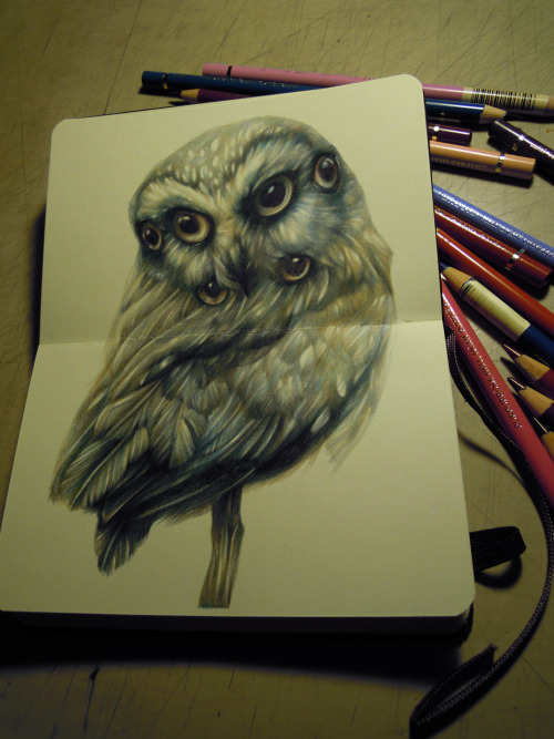
Just a glance at Marco Mazzoni's incredible coloured pencil drawings , addressing some ideas of animalism and hybridity. This links well to the anthropomorphic sideline which emerged from my Pecha Kucha presentation.

http://marcomazzoni.tumblr.com/ 

the judge on my minimoleskine

The Judge - Marco Mazzoni

Finally, I have also asked Claire for some pointers for reading to support the animal behaviour element...her ideas were on point (Thanks Claire!) and have now arrived from Amazon. 

  • The Uses of Enchantment: The Meaning and Importance of Fairy Tales 

  • Becoming Animal: Contemporary Art in the Animal Kingdom-Nato Thompson  

Reflection 

I need to find time to read. I have plenty of opportunities to investigate colour and visual examples with some theory but I have to find time to properly engage and make my reading relevant to my practice. I plan to create some small scale paintings investigating colour in varying grades of saturation, considering the visible light spectrum and reflecting light. Ideally I would like to use oil paint for these as this is my preferred medium but there is a drying time element to consider so this may be problematic - however, multiple small surfaces could help and also some studies in ink, watercolour, coloured pencil just to get a sense of what I could make.

One month reflection 

I have time to read by taking the train occasionally rather than driving:)! I love Marina Warner's Fantastic Metamorphoses, Other Worlds - from what I have read so far this is very relevant for my practical investigations and gives a different insight to doubling/pairing/splitting. I find it curious that it also brought me back to Hieronymus Bosch - Garden of Earthly Delights which was the title of my Studio 7b blog just before I started the MA - most things become relevent eventually. I didn't complete the colour studies in the way I thought I would but so far I have used composition and distribution of colour to try to manipulate the viewer's perception and encounter with the work. This is perhaps a more considered, less spontaneous way of using colour than I am used to but I still believe that it will achieve a better painting in the end.

Thursday, 4 April 2013

Studio: 23rd March

The three figures were made to explore how colour can make something recede or become more dominant, after a conversation with Caroline. I have tried looking away and glancing back to see which pops and I think it is the red one, followed by green. However, as they are linked physically, not separate, it is difficult to imagine them at different distances from my eye as they appear like can-can dancers (not deliberate).


This was a very focused studio session based around exploring colour. I needed to get on quite quickly with the primary colour canvases to make my colour research relevant in the development of my ideas. I have been doing research into glazing techniques and discovered that Old Masters would create a tonal 'ghost' painting underneath the colour painting to fix composition, areas of shadow and light. The three paintings show exactly this - I have used burnt umber and white paint to mock up the figures. The figures are extracted from a sequence of falling film footage - I haven't decided whether they should hang separately or together as they are similar but not the same size, but I quite like seeing them in relation to each other.

Reflection

This was really useful in terms of investigating colour and technique. As the work is quite small scale, I haven't had to make the same time commitment to explore ideas. I need to research the work of Euan Uglow to see colour reflected and used subtly as I tend to automatically be drawn to more vivid shades. Inadvertently, the interaction of the figures has also become very important and certainly now I think it is important for me to consider this in addition to playing with light and shade. In particular, the figure in stages which implies each almost falling into another works - although I have not captured the gaze which is essential in my work.

One month reflection
My research into Euan Uglow's work that I did post this blog entry are still in my mind for when I start working in oil. As I have a natural tendency to work with primary colours, I think this technique should help me to balance the saturation without become too generic. The use of shadow is become more important - I'm enjoying the idea that it might be free-spirited and move independently from the figure. The response to these pieces was much more positive than I felt about them at the time which I struggled with; however it was a good process for me to go through as it made me reassess how open I was actually been to experimentation and it raised some questions from me other ways I could communicate my intentions. 
This is the link to a later entry with some of that feedback...
http://alexacoxreflect.blogspot.co.uk/2013/04/group-crit-15th-april.html
I can also see how the ghost painting was useful in cementing the composition but it ended up being slightly unforgiving when it came to applying layers of colour over the top so when I use this technique again, I will definitely use it to accentuate shadow and creases, but not all contours as it appears too harsh and ironically seems to flatten the paintings.

Saturday, 16 March 2013

Studio: 16th March

Today I set aside the day to work in my studio, to try and develop my ideas for a new body of work. Last weekend I took a large number of photos and during this week I have printed some of them and also selected some stills from video. This was my starting point today - I sorted the photos and selected some to work with...I wanted to experiment with compositions and drawing, as well as colour (although this aspect got lost as I started to evolve other ideas). The drawings below are in order and were completed quickly using, ink, nib, sharpies and pencil. The idea was to bring together figures from different shots to suggest some sort of dialogue or interaction.
Creates a sense of chasing - very similar to corn painting although unintentional. Like the cropping of the limbs (left figure). Some depth - not clear that figures are the same person.
Tried to create a sense of instability - one figure has pushed the other. Is it appropriate to blur limbs to record the movement or is this too close to photography? Quite like the loose brush ink work.


Individually I really liked these images but they seem too static together - it doesn't work that they are nearly the same height (an adaptation of mine not true to life). Many of the pics have arms outstretched horizontally which interrupts the composition.
Dip pen and ink - unstable figure works and hair adds to sense of movement. Added architectural structure to figure - has a flattening effect but could work if more integrated in the body.

I think this works as the figures seem to interact, maybe confront each other. Not sure about the masked faces as they are disengaged from the viewer - I like the gaze element...
Reused the figure from earlier and introduced another (these are stills from a film sequence). I'm really enjoying the instability where she looks like she is about to be blown over. The outstretched arm works in this context seeking balance.


Grid lines are to support composition - better with integrated house (from out of studio window). Animal reference.
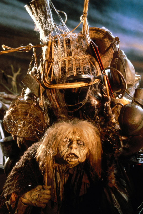
Labyrinth 'Junk Lady'
Grayson Perry - from Tomb of the Unknown Craftsman

Really like the position of the figure but it got me thinking about environment and context (see notes)

Figures in original photo composition - falling not clear
Adjusted position of falling figure - now looks less dangerous, more like cradling...maybe something to do with the feet and leg position


Reflection
I found this process of ideas very useful in terms of evolving my ideas and trying to create compositions. It is very important that I explore the context of figures and make structural decisions before I paint as this created some technical issues in the previous unit. I need to investigate environments and make structures (I'm still thinking about nests and buildings), although I must be careful not to illustrate an idea. At this stage I still want to collect more film as these images have proved to be the most animated which is moving me towards my intention of creating less static images. The pairs of figures work when they are both moving. I have realised that I really don't understand how to create a convincing physical space within the painting, so I am going to explore perspective and foreground, mid and background to create more of a scape. I had forgotten until I started writing that I wanted to look at adaptation and camouflage so I am considering face paint and looking at animal features to integrate in the images.

One month reflection
On reflection, the drawings which seemed most successful at the time are still those which I am working with (in whole or in part). The figure with the building on her back has evolved from my Red Fox painting and I am now planning on using this to show a body-morphing, shape shifting, transient structure. Largely, I am more confident in my decisions about creating 3D space now that I have done some experimenting with colour and there is a sense of ambiguity I can create with the positioning of the figures - my original concerns about this are mostly resolved although I've not yet made any larger scale work.

Sunday, 10 March 2013

Collecting Imagery

One of the priorities for me during this project is to collect a bank of images to work with for painting compositions. These will come from a number of different sources but I hope to maximize the use of my own photography. I am also collecting secondary source images using Pinterest http://pinterest.com/alexacoxstudio/ 
Today I took some footage and stills of small children being 'active' - there are a huge number of photos but I am publishing three examples to give a sense of what I am exploring.


Reflection
I wanted to use continuous shoot and film so I could gather evidence of movement and transition (this could contribute to a sense of ambiguity). I am reviewing the images now and unexpectedly the images taken from video (via print screen) are generally clearer than those from continuous shoot (maybe 1 from every 5 is in focus). On reflection I should have adapted the shutter speed so it was the shortest possible to minimize blurring, although the movements were very fast so this may not have eliminated this problem. The freeze frames where the girls are falling from a jump, or turning seem to be the least deliberate which I like; also when there is a sense of travel or interaction between two of them (for example at one point the eldest pushed another to the side, catching her off balance). I hope that this will be the first in a series of 'image grabs' where I can capture digital imagery which I can develop through collage, drawing and eventually into paint.

One month reflection 
Looking back at these images now, they gave me a really good boost when I needed imagery. I have subsequently taken more photos using sports mode and in much better light conditions (a changing season variable) which has sharpened the images, making them easier to work from and with. I have used what I found out from this shoot to structure pairings and trios in drawings which is helping to build dialogue within the images. I still feel the sense of imbalance in the photos works well to suggest something uneasy or unreal.

Saturday, 2 March 2013

Studio: 2nd March

 Today I went to the studio to begin practical work for reflective practice. As always at the beginning of a unit, I am looking to acquire more primary source material to work from and develop into compositions. I have a plan for how to begin but it relies on coordinating other people so instead I have started with what is essentially planning. It was great to get back in the studio again, just for time to think and be surrounded by my work. 
One of the points on my outline study plan is:

I noticed that I predominantly use primary colours in my work. I really want to experiment with achieving an overall colour in my work like in Edmund Dulac (shown ‘The Entomologist’s Dream’). I will begin with experimental surfaces exploring this idea – I need to know what the impact of limiting my palette will be.

 
I have chosen to create a 'wash' colour background on three canvases first to see how this affects the overall colour of the work. Even as I was doing this I was wishing that I already had figures drawn on the canvas so I could wipe away the paint within the figures' form; this is because I value the light which comes from the ground of the canvas. They have various effects e.g. ragging, drippling and sponging - I am curious as to how these will contribute the surface of the painting. I originally planned to move away from primary colour but I seem to be drawn to these colour palettes - I am hoping that I will be able to make the colour more subtle than in recent works.
 I also did some pen and ink drawing which has rather a scratchy, pleasing quality. These drawings are based on collected images and imagination. I have explored merging animal with human form and falling figures (although both very briefly). This is kick starting my development idea of:
To explore this idea I intend to video figures moving, then take stills from the moving images to capture transitional movement. This should incorporate the suggestion of falling and flying, linking to the idea of spectacle.

and: I plan to incorporate animal characteristics or features in some way to emphasise otherness and blurring of boundaries; this may also be developed into other forms such as buildings or other structures. 


Sketches using animal images morphed into humans plus notes to remember

Cape Gannet - kind of falling due to lack of wings
3 figures reduced to core - not animated enough

Falling figure with odd dog - love the awkward angle and placing with this drawing and the dark shadows

Falling movement almost appears as a performative pose


Immediate Reflection:

It's really invigorating to have time to go to my studio without a plan and have time to think, play and make. I feel that the decision to use primary colours as the canvas ground gives me enough variety to develop the idea of united colour; I will probably explore smaller surfaces with different grounds as well to produce quick colour studies when I have source material. The 'animal' sketches have prompted me to consider a different pathway although I felt that I needed photos or observational work from animals and figure in order to be able to produce convincing drawings. I prefer the more animated 'falling' drawings and could now begin to explore fight or flight, nesting (giant scale) and peril with these as a starting point. Merging birds of prey from Pitt Rivers and trampolining photos may be the way forward...I am also thinking about adding animal features to the face or figure, for example reptilian scales, feathers, talons to move towards shape shifting form - this is why moving figures are so important, I want to capture sense of evolution, escaping or contortion.

One month reflection:

The decision to use primary colours may have appeared safe at this point but having now put all my recent work up in my studio, there is unity between the surfaces. Painting the whole background is proving to have been a mistake as I am lacking the areas of light from the ground of the canvas which I value so highly. I am still in a position where I need to collect more imagery, although I am clearer that the figures need to look less deliberate in their action, more transient and perhaps caught off guard. The issues of anthropomorphism are still ideas - I am having difficulty developing this visual without being too literal/illustrating. However, at this stage I am collating a wealth of references and imagery which I hope later will help me to build and grow narrative.
 

Takanori Aiba


Bonsai Tree Houses by Takanori Aiba trees sculpture miniature architecture

Bonsai Tree Houses by Takanori Aiba trees sculpture miniature architecture http://www.thisiscolossal.com/2012/02/bonsai-tree-houses-by-takanori-aiba/

Thinking about scale and ambiguity, I came across these amazing pieces by Takanori Aiba. The bonsai tree houses seem incredibly intricate and initially trick the viewer into perceiving a full sized structure. I love how the scale is betrayed by the inclusion of pots; this then makes me imagine the miniature people inside. If they were encountered first hand, the impact might be different as the scale wouldn't be ambiguous...however, the view would in this case dwarf the sculpture which would alter their experience of the work. This manipulation of perception and scale are ideas which I really need to peruse further in my current work so maximize the experience of the viewer at the point when they encounter the work.
 

Apparently I am Owl...

 Owl
Genus and species:
Tyto alba
Collective Term:
A parliament of owls
Careers and Hobbies
Bank manager
Judge
Diplomat
Head of state
Reading
Debating
Chess
Philosophy

Famous Owls
Nelson Mandela
Oprah Winfrey
Abraham Lincoln
<
The owl is the tranquil face of the bird personalities. A creature of great integrity, its quiet demeanor accords it an air of mystery and diffidence. It is known as the serene, wise observer of human society. Always well groomed, it is a noble individual with elegantly chiseled features that border on the fine edge of beauty and homeliness. Its large eyes are often framed by handsome eyeglasses.
Owls have developed quite a reputation for intelligence, but it's really their calm and insightful nature that gives this impression. Instead of an intellectual approach to life they use their deeper spiritual senses to guide them, and like their nocturnal cohorts, the bats, have a deeply philosophical bent.
Spending much of their time in solitary pursuits, owls like to hole up in a quiet working environment and venture out only when necessary. They are not a playful creature. Only engaging in exercise and sport in order to keep physically fit, they avoid the more gregarious animal personalities like dogs, dolphins, and sea lions.
Owls are not without their assertive side however, and they won't hesitate to use their razor-sharp tongue to settle an argument. Never the aggressor in a confrontation, they fight only when their survival or honor is at stake and have no desire for a prolonged or physical struggle. Owls espouse nonviolence, think logically, and argue persuasively.
As an astute observer of human nature, owls are eminently suited to be judges or diplomats. Their trustworthiness and dependability find them in positions of responsibility, perhaps as bank managers, heads of state, or religious leaders. A conscientious worker, an owl takes responsibilities seriously, and when it accepts the burden of public office it does so with the grace and skill typical of the species.
With an enormous capacity for hard work, owls achieve great things in almost any field they choose. This success doesn't always translate into financial rewards, but invariably satisfies their need to impart their wisdom to others.