Following my tutorial, there were many lines of inquiry that we discussed that I need to research. Colour is the focus but as I discovered, the ideas are broad ranging and tenuously linked. This is how I like to pursue ideas; they circle broadly round a central theme or interest and gradually become more focused and specific as the work evolves.
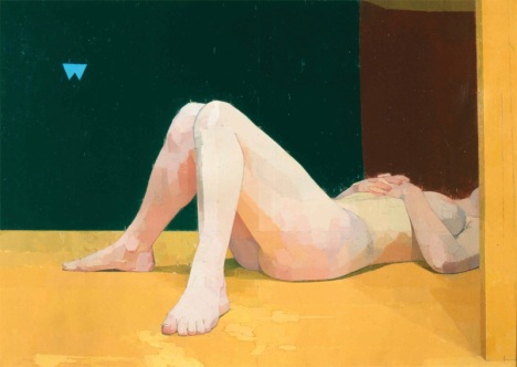
I have researched Ewan Uglow and can see why he is relevant to my practice. The subtly of colour, evidence of planning composition and quietness in the paintings show careful technical consideration. In particular, the way the light is reflected to introduce and unify colour around the painting space shows sensitivity which currently my paintings lack. I don't want to lose all the saturation but this seems to be a more conscious approach to integrating a wide palette.
Ewan Uglow |
http://www.bbc.co.uk/arts/yourpaintings/paintings/search/painted_by/euan-uglow_artists
http://paintingperceptions.com/figure-painting/euan-uglow
http://www.guardian.co.uk/artanddesign/2006/dec/16/art.architecture
I have also researched John Constable's use of colour following a discussion about creating space within a painting by using colours which recede and emerge to trick the eye. This quote sums up a key point about Constable's technique...
'Constable had to create new techniques to give the realistic
appearance of flowing water and wind blowing through trees. By layering
reds with the greens of his trees, the artist was able to create this
depth in a way which had never been done before. Not only this, but the
reds added a vibrancy to the trees, something that was missing from
classical landscapes.' http://www.artble.com/artists/john_constable
The vivid, more saturated reds and lime greens in the foreground of the painting force the viewer to 'see' these first, whereas the blue recedes into the background. |
http://www.vam.ac.uk/page/j/john-constable-learning-resources/
Red Shift Theory
When I was considering perception of colour, it occurred to me that there may be a scientific explanation (although fractional), as to why red for example, is more dominant in our vision than some shades of blue. I had a very enthusiastic debate with my A Level students (some of whom also study Physics), which made us consider wave length, sensitivity of cone cells in the eye, and speed and energy of waves transferring coloured light. I am going to pick my dad's brain (astrophysicist) and come back to this, but there must be an explanation as to why our brain interprets and receives colour in a certain way. This of course may not be the same from everyone...
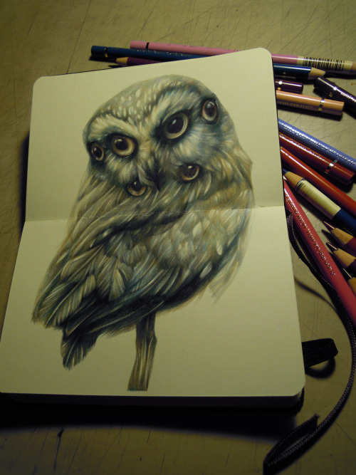
Just a glance at Marco Mazzoni's incredible coloured pencil drawings , addressing some ideas of animalism and hybridity. This links well to the anthropomorphic sideline which emerged from my Pecha Kucha presentation.
http://marcomazzoni.tumblr.com/
The Judge - Marco Mazzoni |
Finally, I have also asked Claire for some pointers for reading to support the animal behaviour element...her ideas were on point (Thanks Claire!) and have now arrived from Amazon.
Anything by Marina Warner http://www.marinawarner.com/index.html
The Uses of Enchantment: The Meaning and Importance of Fairy Tales
Becoming Animal: Contemporary Art in the Animal Kingdom-Nato Thompson


No comments:
Post a Comment