We visited Waddesdon Manor and saw the Bruce Munroe exhibition - amazing light installations which respond to landscape and come to life at night. I saw Munroe's work preciously at Waddesdon but couldn't fully appreciate the overall effect of the lights due to closing time being marginally before nightfall! However, the short film clips captured the work beautifully and the new installation - reminding me of aurora borealis - was magical and made the viewer interact with light and reflections as they moved around the space. Light can create a sense of space, inhabiting artificial dimensions and allowing the audience to move between the real and imaginary. It also heightens darkness and shadow and brings context into play.

http://www.waddesdon.org.uk/collection/exhibitions/bruce-munro-cantus-arcticus
http://www.brucemunro.co.uk/
http://www.haywardlightshow.co.uk/
Anthony McCall - 'You and I , Horizontal' (2005)
http://www.guardian.co.uk/arts/gallery/2007/dec/12/art.photography
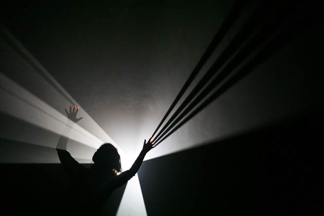
This was utterly enchanting; it was curious to watch how visitors engaged and interacted with the work and then when I went into the beam of light myself, the people around me were reduced to shadows. There was a quietness and consuming quality to the work and the audience's ability yo influence the shadows and lines made the work personal and unique to each participant. You also had an ability to block the light from other viewers which engaged an element of power in the space.
Jim Campbell 'Exploded View (Commuters)' (2011)
A flickering, suggestion of figure. Movement evoked by twinkling and fading lights. Constellations interrupted by shadows. Fantastic.

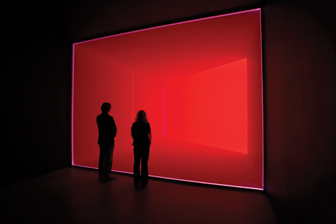
James Turrell 'Wedgework V' (1974)
There was a rather grim invigilator guarding this piece who warned off a woman who expressed that she felt as though she could step into the piece. Hypnotic, captivating and illusory, Turrell creates an illusion of space inhabited by light which tricks the eye. Again, I was intrigued by the relative saturation levels and intensities of red and how these merge and recede - must bear this mind for future paintings.
Carlos Cruz-Diez 'Chromosaturation' (1965-2013)
http://www.hirshhorn.si.edu/collection/carlos-cruz-diez/#collection=carlos-cruz-diez
'...colour does not consist of pigment on a solid surface, but is a 'situation' caused by the projection of light on objects, and the way in which this light is perceived by the human eye.' (Light Show Booklet)
I really responded to be inside this installation; the most absorbing element was the way that my perception of the colour/light altered according to my position in the space and how colours blended and changed in relation to others.

Found this in the bookshop...
http://www.davidbatchelor.co.uk/books/chromophobia/
'Chromophobia manifests itself in the many and varied attempts to purge colour from culture, to devalue colour, to diminish its significance, to deny its complexity. More specifically: this purging of colour is usually accomplished in one of two ways. In the first, colour is made out to be the property of some ‘foreign’ body - usually the feminine, the oriental, the primitive, the infantile, the vulgar, the queer or the pathological. In the second, colour is relegated to the realm of the superficial, the supplementary, the inessential or the cosmetic.'
I think these are brilliant points and relate to some responses I have had when introducing colour as a theme, particularly with students. Perhaps this suggests that my decisions for use of colour need to be more founded in theory, more purposeful, less saturated and whimsical. Or perhaps, I can just enjoy colour and use it emphasise the sense of 'Other' in my work.
http://www.tate.org.uk/art/artists/josef-albers-636

Fascinating to look at flat blocks of colour in the work of Josef Albers in my colour inquiry. It seems obvious but I think this is a great example of how the same shade of colour, viewed in a different context can appear more dominant. Although this style of work doesn't appeal to me, the theory behind the construction of these paintings is extremely valuable when making decisions about hues in my own work.

No comments:
Post a Comment