Paint Box

Tuesday, 16 April 2013

Group Crit: 15th April

Here are some notes and links from yesterday's group crit which was generally positive - on a random note, everyone in our group is dealing with birds or nests of some description...maybe there's something in the water!
Comments included that the new paintings (ghost underpainting) looked like a graphic novel, action style poses - not sure if this is a positive link to narrative?
Have I thought about changing the order of the tryptich? - yes, this is intended to be interchangeable but not meant to hang together as uneven in size.
The gaze has changed to less confrontational as the eyes are averted, this makes the viewer more voyeuristic as the subject appears unaware of the viewer's presence.
The pink background piece has some element of gaze.
There seems to be a change of confidence in the figures as they seem to be hiding, diverted gaze.
In earlier paintings the 'gaze' intention was more straightforward - an 'oblique' way of dealing with the gaze. There is a less direct challenge - they are less aware of being watched. Does the gaze need to be direct? I value the eyes.
The ambiguity is still there and the viewer is made to feel awkward. The body position is also awkward and twisted.
There could be a horror film face behind the hair, it  feels uneasy.
Could one of the figures be a scarecrow? - hair emerging from the hood, no hands and a stuffed body that the viewer has stumbled across - links intriguingly with metamorphosis
Discussion based around not 'illustrating an idea' left me tangled in knots, I couldn't explain why this was something I am concerned with. I need to do some analytical readings of Paula Rego and Peter Doig's work - narrative but not illustrative. 
I need to investigate strategies to disrupt a straightforward reading of the work but don't want to avoid giving the viewer a way in by relating with their experience.
There is also a difference in scale and the context you encounter an illustration - don't be over concerned with avoiding a perceived negative feature of work, just go with the flow.
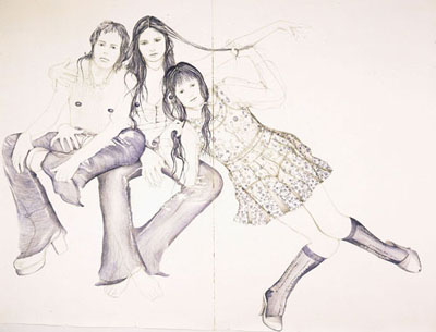
Pushing and pulling of drawings and tangled hair is good.
The red figure is most prominent - confirmed by others!
Look at Barbara Hepworth, the individual in the landscape.
Personification and merging of person into context - feels like I'm going back to the yellow wallpaper again.

Reflection
I felt much less confident about my painting sketches and went into the crit feeling that they needed excusing from my body of work. What I found out was that through working in this way and completely out of comfort zone, I have explored a different area of gaze and figure to that which I usually would, which raised interesting debate. I do still want to use eye contact but this can be mixed with averted gaze and masked/hidden figures to add to ambiguity. This could work really well in a series of pieces. I also hadn't realised that I was exploring metamorphosis quite subtly (scarecrow observation) and where the hair and figures in the drawings overlap this suggests linking, splitting, mutating, blending, twinning.
Dorothee Kreuzfeldt
I am going to research the work of Dorothee Kreuzfeldt, Elizabeth Dismorr and Hanna Ilczyszyn (from Jane) and produce some more tangled drawings. It might also be appropropriate to revisit Jenny Saville's charcoal drawings and Mary McCarty's 'Marlene'...


Elizabeth Dismorr
Hanna Ilczyszyn
Jenny Saville
Mary McCarty - Marlene Olive

One month reflection
I haven't worked on these pieces since the crit as I have been contemplating them from a distance. I feel they need to be dealt with individually rather than as a group, particularly as it was pointed out that they are different sizes. I will reengage with them when I get into working with oils as they will become part of the painting rotation. The highest impact on reflection of this crit was the effect on my confidence as I felt very uncomfortable about showing this work and the group were very supportive which helped me to recognize the value in what I had created.

Wednesday, 10 April 2013

Studio: 10th April


I have been working into the three colour study paintings with glazing; this is a slow process so these pieces eventually will run alongside a body of other work. I have also been generating more drawings to explore composition and context and relevant reading. These sketches are bring together figures which are intended to link - some repeat a figure in a different position, some show progression of movement.
I wanted to experiment with placing figures next to each other - I don't think this works as they don't inhabit the space convincingly. Perhaps I could add colour to suggest depth.

I quite like the way the composition suggests a dynamic between the two figures, although this is odd as the scale of the girls is inconsistent and again the space isn't convincing. However, the awkwardness works in terms of creating an ambiguous image. 

is beginning to create some depth and I like the way the figures link through touch. The egg looks odd, the figures sat on it doll-like and the middle figure seems to want to roll her off her seat. Curious how the diagonal emerged (made less obvious by the shadows) - not sure how I feel about this as a compositional device although it does lead your eye through the image.
 
Another more static composition using the diagonal - this reminds me of the Midwych Cuckoos and has more potential for employing the gaze. Strong shadows work and this links to my development of under painting in oil to heighten tonal values. I very quickly added vertical brushstrokes to suggest trees to place the figures in a setting - this certainly creates a space and a sense that they have emerged into a clearing.
Introduction of colour glazes of yellow, blue and red. Interesting to see how the background glaze affects the overall look. At the moment I prefer the yellow as it interferes least with the later layers.
 

Added vertical lines in background and marks in foreground to create context - think the figures will look more convincing in a setting rather than abstractly floating.

Added some colour glazes over the background lines to try to push them into the background and some mark making to right and central foreground. Remember that these could be viewed together or separately as they are all different sizes.

 Detail of red ground - the yellow seems to emerge the most where the blue/brown recedes

Blue ground painting - red highlights in the hair and on the socks push forwards. I don't think the blue background works with the blue clothing as it appears too overpowering in the whole image.

This is my favourite figure because of the way the body twists in on itself. Here again, the red and yellow pop where the blue is more harmonious and muted with the green marks in the background. I have begun to use red on the ground to bring the bottom of the painting forwards.


Reflection
It feels strange to be working on smaller scale paintings to investigate colour but it is forcing me to make decisions as I go as I tackle the technical aspects. I know that I need to keep drawing and am also planning to do some printmaking to test compositions for bigger pieces. I am now being tempted by my new canvases but know I need to stick with what I am doing while I enhance my theoretical and practical knowledge. Relatively, the paintings seem more muted which is a success as I intended to reduce the saturation. However, I am still really bothered by the lack of gaze as this is such a dominant feature of my work, so I need to revisit this using drawing to find a way to integrate the two ideas.

One month reflection
The group crit gave me really positive feedback on my use of lack of gaze and how this opened up a different sense if unease and power in my work. I am wondering now how I can combine the two. The tangled hair idea has great potential as it seems to hold energy like Samson's (and Delilah) - it works with drawing but need to experiment more with wet media. Certainly the feedback that I have had has been more in favour of the moving than static compositions. I find it funny that I wrote that I was tempted by my new canvases but was holding back...I'm relieved that I did as I hadn't taken the new series of photos at time so I may have regretted it later, but I prefer to begin quickly and work on multiple pieces. Perhaps this is why I have found this unit really difficult so far.