Paint Box

Wednesday, 31 July 2013

Making Day: 30th July


Great opportunity for a making day with Claire yesterday - we agreed that we should initiate more sessions like this (probably Saturdays) over the next year where anyone can drop in as the real time feedback is so valuable. We spoke for 45 mins at the start, followed by an hour between 2 and 3, and later followed by an email exchange possibly to follow up at a later date.
I worked on the two main pieces for the first session, then some tweaks and my smaller experimental surfaces later. I have included pics from today and notes from feedback...


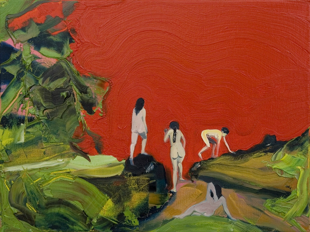
Attention to hands - articulated cylinders, easier to work observationally

The creases in the clothing work really well

Shadows under her feet are misleading - in particular the one on the right where the shadow appears to go over the toes

Palette knife works really well, particularly in the background forest

Need to get a balance between worked up and under worked - evidence of drawing

Light under dress needs to weight figure - would a shadow by cast?

Hair is flat at the back - perhaps needs a darker glaze to appear less 'cutout'

Landscape is jungle-like, Peter Doig influence is clear, shapes are good

Figures joined by hair/arm, seem to be peeling apart,something strange happening with the light

Difficulty with light - should it be dappled? not a tree canopy but surrounded by foliage

Weird wormy pattern on shorts, background, plaits work well

Clothing is meaty, visceral, like muscle fibres


Notes emailed from Claire:
I really like img2120 - something really interesting happening there - v ambiguous - is she emerging from something (the floor?), changing into something, being formed, or just getting dressed? And different handling of paint to your usual work. Makes me think of Michael Borremans in composition (although not in how the paint is handled).
Img2121 - interesting luminosity coming through, love the gold and the aqua against the other colours, delicious. Img 2122 much darker, subtler, also lovely in its own way.

Img 2123 look as though it might become interesting, but hard to see what it is at this stage - a small shadow and big person with a cauldron? Quite fairy-tale-ish and dark.

Img 2118 - really like the sky at the top - the whole mood of the piece has changed, much more threatening. I can see the hands have been worked a bit more I think? But I can't see in enough detail to comment.

Reflection
This was a really constructive day of making. I would have spent the day making, regardless of interactions but checking in for dialogue was really useful. We were able to have very open conversations about how we perceived criticism and forums for giving feedback. Certainly, the making day set up gives real time feedback and allows you to immediately go and tackle issues which come up in the work which may otherwise be forgotten. Not a problem today, but it also made me think about how I had had to push through barriers of extreme discomfort in exposing work, and although this is not an experience that I want, the feedback and support that results from being open is invaluable.

One Month Reflection
This is another example of how the links and relationships that have evolved in the group have become a support network which functions in a more professional and objective way. I think my next step is to forge links with artists outside of the MA group with a view to maintain professional practice and having more local support and opportunities. It's important to remember the value of making days and use these to develop my ability to give feedback and talk openly about my work, without feeling vulnerable. I'm thinking about this as a possibility for working groups in the run up to  the show so we become more interlinked. It is possible that the work will compliment each other and reflect our professional dialogue. Really exciting stuff!

Studio: 25th July

Used this time to work into my square paintings and experiment with some drawing techniques. I am well and truly in the process of building up the surface of the paintings, the warm weather is making the paint dry more quickly but there is still at least a 3 day wait between each layer. 

I have been thinking about drawingness and how this relates to the work I am making. This can be through style, or referencing marks and illustration but it is something that I come back to, but never really stick with. Our drawing dialogue project should bring out some of the ideas I'm thinking about, and I hope that these will feed into my painting practice. Having said that, I have opened the oil bars and there is something extremely satisfying about working with a stick rather than brush and some of the marks are quite Peter Doig which pleases me!
Repainted face to make less vampy, know doesn't sit well with surface of rest of painting, need to glaze lighter colours over to loosen up

Added drawing lines to edges of bank and suggested features on face - doesn't need to be as defined as foreground figure to create hierarchy of power

Having difficulty incorporating reds into the foreground - blended some light pink into the water and warmer sienna shades into the earth

Adding diagonal stroke to hand to suggest shadow - think the staining on the thighs works but perhaps shorts material is too pictorial?

Redrafted configuration of face - not keen on the outlining but at this stage this works to introduce an expression indicating a sense of power struggle
 
Reflection of surrounding colours on flesh - although this is soft and beautiful (my opinion!) the light balance means that it will need another darker glaze. Love the suggestion of the twisting plait:)

Water and start of reflection - Doig inspired pink paint and sprinkled white pigment - this has proven to be very difficult to deal with in later glazes as it stays as raw pigment powder which contaminates the other glazes

Chisel brush strokes to articulate edge - still gestural but also maintains structure


Reflection 

Fantastic first full day of the holidays - finally I have time to sit with my paintings and really work out how I am tackling the changes which seem to be happening. With the reflective group sessions still firmly in my mind, I am taking risks more confidently. It was a strange realization that I really have moved on so far since the first meeting in Barnsley - that the aesthetics and visuals that I valued so highly have be overtaken by my desire to depict an idea. I couldn't imagine how my work could change - and now, I am making conscious and unconscious decisions which demonstrate my change of mindset and values attributed to certain work characteristics. This is particularly evident on the faces of my figures of course (as these are the only part to compare to of course). I have lost the translucency in the face - this is largely due to the figure looking disconnected to the setting where I have applied more glazing, layering, under painting and wet on wet painting techniques. Although this doesn't look as 'attractive', the overall surface hangs better together and when I use my view finder technique to examine isolated elements, the paint itself is taking on a more refined and exciting quality.

One Month Reflection
Having now 'resolved' these pieces, this was a really important point in the process where I recognised that I had 'let go'. More confident, less static and having less fear of being judged for work not being 'right' has let me move further in my thinking and work this time. Pushing into this unknown area of making has moved my work in a different directions and has opened opportunities for me to explore over the next year for the final unit and MA show. I made what feels like a lot of a changes to the paintings after this entry. Having a limited time left to work, I really had to prioritize my time and address issues with the whole surface rather than smaller sections. This was good for me because I had to be very critical and objective to make smart painting decisions - definitely a skill I will need in the future.

Group Reflection

Interviewing and being interviewed in groups, 22nd July 2013.
Eleanor's notes on my responses:

1. Did the Reflective Practice unit go as planned, or were there unexpected developments?


Still half way through the unit. Didn't plan except for the reflective strategy. No concrete idea to start, but honed in on certain aspects such as colour.


2. Have you discovered new aspects to your art practice?
Yes. Realised things. Had to let go something previously thought ok. Thin layers now towards gestural painting. Still like the initial MA painting, and retaining the translucency, but have let go of the aesthetic for the sake of the idea. Something of a revelation.


3. Have you reinforced and recognised aspects of how you work?


Still using similar techniques of drawing, painting and photography, but monthly reflection gives more revelation of the idea coming through, rather than more immediate reflection which tends towards technical skill.


4. How has your work and practice developed since the beginning of the MA?


Hugely. In the way I think. Physical appearance completely changed - more factors. Was simple and easy, now complex, coded and multi dimensional. Still looks like my work, but polarised. Investigating the journey from there to here.


5. What ideas/artists inform your work?


Reading Marina Warner - Metamorphoses - hatching, splitting. the constructed narrative. Anti chronology - a series and what characters and scenes the viewer encounters. Still lusting after Peter Doig's paintings. Also Paula Rego, but more the process of making in the studio, the history and performance behind works. Want to keep away from the fairy tale and be more menace-like. Setting up a power struggle or dialogue.


6. Do you think there are other media and genres you could work in?


Not moving away from the idea of narrative - it strings everything together. Have used video still for movement in painting. Would like to do more printmaking for graphic qualities, also for series and replicas. Would like to make objects, creatures, animal heads, not as sculptures really but more as props.


7. How would you describe yourself as an artist?

Prolific. Slow.


8. What advice would you give to a much younger you?

All the decisions you make now will work out, so have confidence in your own confidence.


Reflection
Eleanor commented on my new found ability to express my ideas - 'I could talk to anyone about my work'. This is a fantastic revelation for me, and confirmed by E,  and we were talking about our one-to-one crit from a year ago where she commented that I couldn't even say basic things about my practice. I was pretty gutted about this at the time, although I knew it was true, and this year have been on a mission to develop my vocabulary, articulate my ideas and prioritize the ideas over the making. When I write about my experience of this unit, some of the observations made about my journey by others must be included as they have helped me to recognize and confirm how I have rerouted my practice and rearranged my thinking.  The dialogue and interview process was really comfortable and we reflected on how much the group had matured and how we are useful critical companions in this process.

One Month Reflection
This conversation really gave me confidence and fueled some of my reflective review. I have had a few comments about showing the journey, and spend quite a lot of my time evidencing the progress that I have made which is difficult when working on a small number of sustained works. However, having someone from the group recognize and reflect on the progress highlighted just how far I have come:) It also showed how committed and determined I had been in trying to change my practice and ingrained behaviours, the impact of which is now becoming clearer.

Lucy Day

I had a really productive conversation with Lucy Day about my practice and she was able to give me some pointers for particular areas.  She said she responded to the looseness of the most recent work, the previous unit's work was too contained. She gave me some advice about photographing my work and how the angles and cropping needed to represent the work better as this would make a real difference to how people encounter my work.
She liked the tumbling house falling, and the darker palette which created a sense of foreboding, unease and menace. She said I should think about the compositions first - not sure what this means from my notes as I always start with composition.
We spoke about open studios and how it is important to target my audience and push my networks. My statements are good and match with the work! She gave me ideas about what to include on an artist CV for exhibition entries - to include a 100 word version of my artist statement. Make it professional, be confident. She said not to push the current work much further. Apparently painting is coming back into fashion (hooray!) - she gave me a number of artists to look at (below)...

Notes from Lucy from our talk:
We talked about her painting technique and composition. Had good open
conversation about some of the tighter paintings as I prefer her much looser
ones as they seem to relate more to her ideas of menace, unease, manipulation.
She is experimenting with the medium and there is a danger that the
composition can lose ground through this experimentation. Also talked about
how she has documented the work as they will need to be re-done as they don’t
do justice to the work ( bad angles so distorting the canvas a lot). She raised
concerns about CV’s and the whether  open studios were of value so we talked
through how to  develop your audience by targeting key people for visits for
example.


Reflection
Really pleased with how this meeting went, I felt it was very positive. I am so much better at talking about my work and ideas now than I was a year ago that I feel confident to begin to try for more exposure for my work. The photography comment is a fair point - I am already sorting this out. I also realised that I am far less sensitive and defensive about my work - Lucy kept saying she was being really harsh but I used the feedback she gave me to think about another aspect of my practice. I am trying to strike a balance between loose and structured (composition); as I have come from a point where my work has been faint and fluid, and the last unit's work extremely tight in comparison, I am shifting between these too states. I'm not ready yet to stop pushing the work but I going to experiment with leaving some areas more loose and evidence of some drawing.

One Month Reflection

  Artists recommended by Lucy during our chat...
Geraldine Swayne
http://geraldineswayne.org/
Camilla Horn Large
Dan Coombs
http://www.dancoombs.co.uk/
The Bathers 2011

Mark Wright
http://www.carterpresents.org/markwight.html


Fiona MacDonald
http://www.maddoxarts.com/artists/works/fiona-macdonald/
Fiona MacDonald - Cumulissa
Lee Maelzer
http://www.leemaelzer.com/index.php?/recent-paintings/place-to-be/
Garden, 2011,  oil on canvas, 160 x 260 cm
Nadege Meriau
http://nadegemeriau.com/home.php


Aly Helyer
http://www.alyhelyer.com/index.htm


Tuesday, 2 July 2013

Studio: 22nd June

Back in the studio for a hardcore weekend of painting - I'm very aware of the time ticking away from the deadline but I can't rush the painting process so I am expanding my surfaces to allow for drying and thinking time. I have decided to work slightly more aggressively on my paintings to change the mood to something more sinister, and to incorporate different marks including using a palette knife.

Whole image - contrast is more obvious, there are areas (like bottom of legs) which are awaiting glazing but I quite like how the background is starting to fill out an become more alive.

Detail of palette knife work in background. Think this is too contrasting but I'm enjoying the range of marks.

Detail of glazing on water and powder pigment used to create a different texture. Trying to suggest reflection...

Whole view showing change in colour - much more tonal, a huge change from previous more primary colour based pieces

Detail added into landscape using chisel brush and palette knife to add more dense areas to create depth

Experimenting with overlaying thicker areas of paint over the stream to try and bring the foreground forward and create depth in the water

Studio revamped for Summer:)


Drawings for my box which is just another surface to work on; just some example of what I have been recording, more to come later...
Exploration of hybrid/shape shifting - awkward composition due to angles and figures don't interact'

Inspired by Leda and the Swan - like the way swan is preying, aggressive and balanced precariously on wobbling egg

Again facing in different directions. Think the gaze over the shoulder (left) works really well. Limited colour palette also works for harmony throughout.


Hybrid siren - a bit too mermaid like but sinuous curling body has something uncomfortable about it which may be worth taking forward.

6 small canvases with backgrounds ready to draw into as another surface.
Reflection

I'm very excited at the most recent studio developments. I seem to have successfully effected the mood of the paintings to suggest something more sinister or dark. This is important to emphasize the sense of unease and darker narrative.  It was fantastic to get some more drawings generated as I have realised that I sometimes reflect that I must explore an idea, but sometimes don't get round to it. I produced 10 in total in this studio session and having a quick way of visually recording ideas is really useful to collate a collection of images in the same way I might have done previously with magazine clippings. This process has enabled me to quickly identify aspects which work and those that don't. 
I am still actively reading but am aware that this is not necessarily evident in  my blog although my work is clearly grounded in theory. There are certain features which are emerging in my most current work which need acknowledging at this point...

Water
Water is reflective, fluid and moving. It represents nurture and survival as well as threat and danger. It references the mirror and narcissus. It belongs in open space but can also suffocate.

Conflict and contrast
In colour, materials and figure. Exploring opposites and binary, relativity and difference. Light and dark with a suggestion of shadow.

A curve leading away
This is a compositional decision to lead the viewer's eye through the picture scape but also references the feminine. Chronology and cycles disrupted as the curve disappears. Distance and pathways leading out of the image and into another imaginary space.

Birds and eggs
Hatching, rebirth, falling and flight. Linked to Marina Warner's ideas of hatching and splitting. Mythological references and anthropomorphism. 

Houses, structures and shells
Protection and movement. Transience and an acknowledgement of danger. Hard and soft. Shape shifting ability and a sense of home or nomadic status. Deceptive symbols of comfort but awkward and heavy.

Natural environment
Environment can become an additional character - looming, threatening, crowding. Personification of inanimate objects. Impact on scale of the figures.

One Month Reflection
There were 3 key things which I need to refer to from my previous reflection. It was invigorating to allow myself to go back to drawing to keep ideas flowing - I don't know why I didn't give myself time and space to do this before but I have adapted my studio time to devote a little time in every session for working on a smaller scale. I am also really involved in researching drawing techniques and using these to generate ideas for future work. I don't want to forget ideas or devalue the drawings I make, so will collect them and revisit them as my work develops. Cat and I have now started our drawing dialogue project which is helping to loosen my drawing up - although this is not directly linked to this body of work - it joins as part of my exploratory journey. I am also thinking about 'drawingness' in my work - that's as far as I have got at the moment but it is there, waiting for an opportunity to emerge.
There has been an overwhelmingly positive response to my menacing dark tones, and I have at this point achieved what I consider to be a beautiful paint surface in one piece which compliments rather than compromises the concept.
The notes I made on features in my work were really useful when I have recently been talking about my work. This is a strategy which I need to continue to use and revisit as it clearly articulates my ideas and vision and justifies decisions. I am interested in rolling some of these out as motifs to link pieces together, referencing anti-chronology as well as implying a series.

Sunday, 2 June 2013

Studio: 25th May & 1st June


I have included photos from 2 studio days to show progression - 1st June was a really productive studio day! Last week I was really knackered from work and had difficulty concentrating (although did glaze a layer on both) but on Saturday I worked solidly for several hours on each painting and am beginning to see the composition more structured. As a result of this, I made some decisions which involved obliterating and repainting angles in facial features. I hope that this will help to add depth with the addition of glazing later on.
Building up layers in water and beginning to add leaves and 'blossom' to background trees - they need to be quite dense but allow some blue sky to come through to create depth

This appears slightly darker than it is due to studio lighting. Obliterated the mouth of right figure to repaint - not sure if I could leave it masked or whether this is too obvious. Building up layers in the water, pathway and foliage in the background. Key decision about glazing made in the hair of the left hand figure to add structure to smaller scalp - really like this now.

Glazed some further red and sienna into the foreground and skirt to bring figure forwards. Added blue wash to background figure (still no face). Need to start adding green layers to ground to make earth more convincing. Strategically wiped off areas of water to create sheen on the surface - like the contrast of vertical and horizontal lines on land/water.
Overpainted with white to make head more three-dimensional - noticed it was rather flat and unconvincing. Under painted creases onto face to continue to sculpt features - think this looks quite doll-like, reminds me of Ibsen's 'A Doll's House'. Finding it quite difficult to add glazing to the water as it needs to convincingly recede so taking it slowly. Have also added green glaze over foreground earth which (not terribly clear on this photo) begins to blend red and green to make the use of red less obvious.
Reflection
I am really pleased my progress with these paintings so far, although am impatient to move them forwards. I have been reminded in the last two sessions how important it is to reevaluate and reflect on the compositional elements of paintings throughout the process, rather than drawing and filling in. To review, rework and redraw allows the painting to escape becoming stagnant, although there is a stiffness to these lines which makes the figures appear more static and fixes. I just discovered Alice in Wonderland syndrome (micropsia and macropsia) and thought that this linked in with my ideas of colour/perception and scale/perception. It seems relevant in the context of these pieces and is definitely worth researching further. I can explore what makes us perceive objects or people as real, larger, smaller, animal and how to manipulate perception to force this sort of encounter with my work.
http://www.guardian.co.uk/lifeandstyle/2008/feb/16/healthandwellbeing.familyandrelationships
http://www.ncbi.nlm.nih.gov/pubmed/23446681
In addition, I need to further contextualize my use of water in both images which was conscious but not deliberate. Fluid - yes. Open outdoor space - yes. But what does water represent? what does it mean in the context of my work? A quick Google tells me that water can mean...
'Water is a universal symbol of change and is often present at turning points in a story. Since water is often a sign of life, many times water represents life. Water can also be up into two categories: fresh water and bad/polluted water. Fresh water can represent good health, and bad water symbolizes bad health.'
'Water represents the unconscious mind, and the unknown.' - sounds dangerous. I will come back to this.

One Month Reflection
I definitely need to reengage with (micropsia and macropsia) which I had found and forgotten almost in one moment. However, there are elements which are emerging in my current large paintings, in particular the falling house piece where the perspective and relative scale of figures and objects are all slightly, deliberately wrong, to manipulate and disorientate the viewer. The vast, sweeping landscape also seem to be personified and menacing - I suppose this forces an encounter with the whole painting rather than just through the figures' gaze. Also, this another example of a piece where the gaze is averted rather than direct making the foreground figure seem lost. Just a technical comment about recording progress - I need to remember to photograph my work using my SLR rather than on my phone as when I have transferred and tried to annotate these images, the quality is poor.